


Christopher Anderson
»Stump«
»While flipping through the 500+ books on the tables at Les Rencontres d’Arles this year, this was the book I found myself returning to over and over again. Without knowing anything about how or why these images were taken, I was intrigued. stump, I soon found out, is a selection of Anderson’s political pictures commissioned by New York Magazine. But rather than telling a story with a beginning and an end, these pictures are a meditation on faces. Maybe it’s the inf luence of Netflix’s series House of Cards that I’ve been watching recently, but in all these close-ups of politicians trying to come across as sincere and beautiful I now see a cunning Frank Underwood, who will do anything he can to fulfil his own goals. Looking at the sur face is fascinating.«
— Thiijs groot Wassink / WassinkLundgren —
London


Paul Andriesse
»Compared to What«
»This book is a relief. No obvious subject or specific theme, timeless, a very modest amount of pictures, black-and-white, no narrative involved. The design and printing are great, size and tactility are good, the title perfect. The 16 photographs are balanced and intriguing, serious and light, about nothing and everything at the same time, visually puzzling. At first sight, the book raises questions because of the juxtaposition of funny vignettes and photographs that seem independent of one another. But after reading the text by Oek de Jong and after understanding what the vignettes stand for, or could stand for, a whole world appears. The book is both a statement and a poem, a wonderful offer of connections, an ode to music, literature, art and life.«
— Cuny Janssen —
Amsterdam


Ruth van Beek
»The Arrangement«
selected by Willem van Zoetendaal
»Designers who are also able to edit images are the best photo-book makers! They know how to make the right montage and are also able to vary the size of the images to finalize the music on photography. Most image makers / photographers have a natural distance to their own work; they are more inward-looking. Designers are the opposite. Still, even these days most photographers call their books photographer’s books. (Why?) Designers who understand the music and alphabet of photography can bring the medium of photography to a higher level, a new context. There is nothing more difficult than to bring a series of works together, each of which is valid on its own and not connected by a story. Xavier Fernández succeeds every time when he makes photo-books by taking the right distanced stance. He succeeds in building a ‘house’ for every photographer / artist he designs for. The hallucinating and at the same time very naïve collages by Ruth van Beek seem to find their natural environment, the final place where they belong, in the book by Xavier Fernández. One might say; ‘without images, no book’ but I would like to say: ‘without this kind of design, there is no book yet’. The book is a sensitive presentation of the funny (Can art be funny? Yes it can.) and at the same time smart and vital collage-images by the artist Ruth van Beek.«
— Willem van Zoetendaal —
Amsterdam


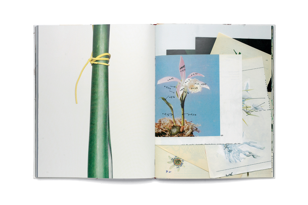
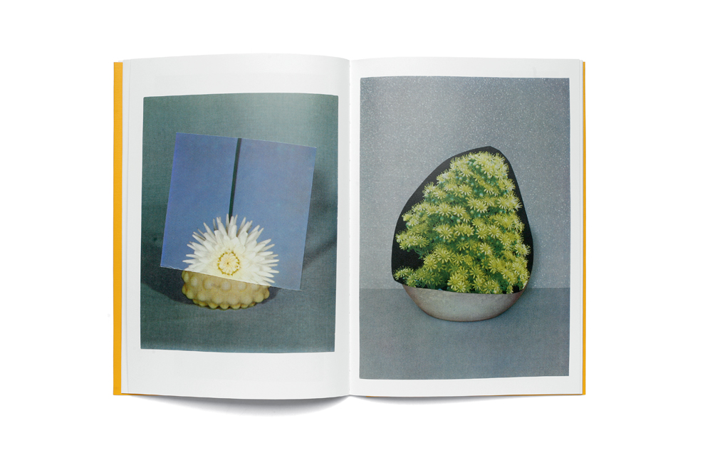
Pawel Bownik
»Disassembly«
selected by Thomas Sauvin
»For his DISASSEMBLY series, Bownik finds new uses for the classic motifs of flowers and plants by disassembling them and seperating the stems, stalks, flowers, leaves and buds, and then reassembling them using household tools. In his conversation with Jakub Swirez, Bownik describes his work as ‘An attempt to present plants, a classic motif in art, in a new form, one which accords with what I perceive in the present age.’ Indeed, through this process, nature herself become subject to experimentation, wisely evoking beauty, plastic surgery, death and resurrection. By combining Bownik’s hyper-realistic photos with strangely annotated botanical studies, DISASSEMBLY creates an unexpected, intense and meaningful visual experience.«
— Thomas Sauvin —
Beijing

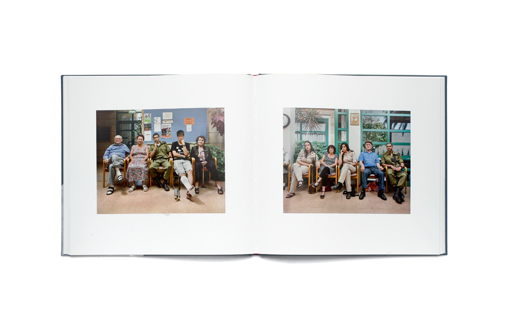
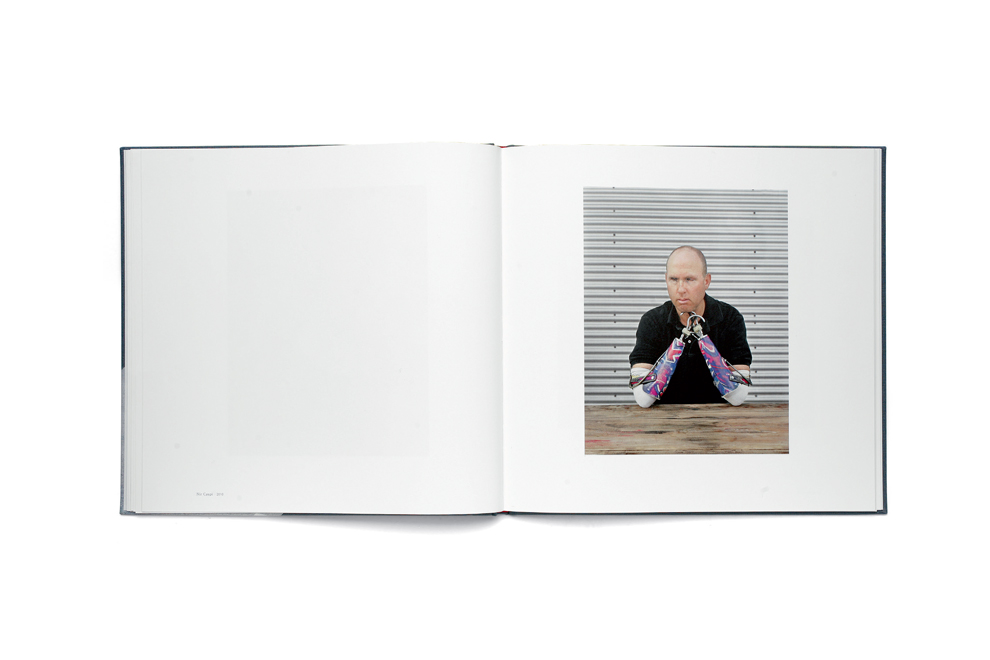
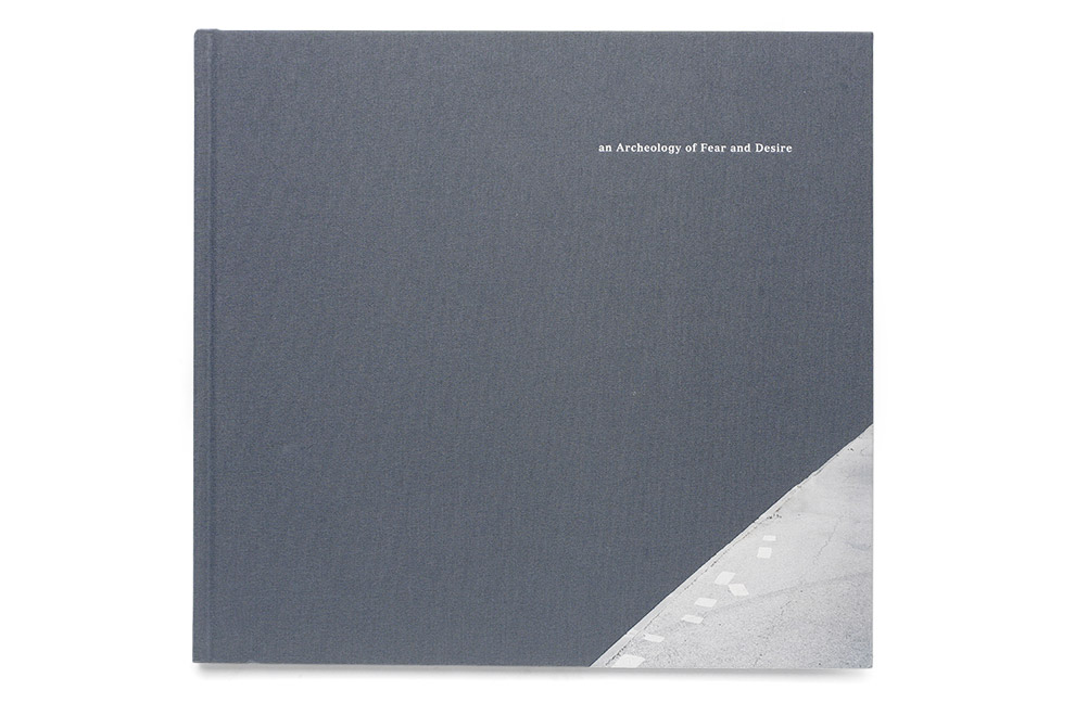
Frédéric Brenner
»An Archeology of Fear and Desire«
selected by Laura Moya
»AN ARCHEOLOGY OF FEAR AND DESIRE is Frédéric Brenner’s visual exploration of contemporary Israel as metaphor, giving us images that examine the complexities of identity and the myth of appearances – familial, social, and religious. Portraits are made with an 8 x 10 camera and a small depth of field: a man with a stitched scar running the length of his face, two lovers surrounded by a forest of giant cactus plants, three men with extreme facial coverings at an airport. Urban and rural landscapes show different versions of what the “Promised Land” is (maybe) supposed to mean. This is a quietly fine book, easy to hold – but the viewer is left with the feeling that although the imagery is beautiful, there is much we don’t know.«
— Laura Moya —
Portland


John Cage and William Gedney
»Iris Garden«
selected by Jason Fulford
»I’ve often considered designing an unbound book, but the concept and content have never quite matched up. I usually end up concluding that an editor’s choice of sequence is better than a random shuffled order. iris garden, a book by Little Brown Mushroom that combines short texts by John Cage and photographs by William Gedney, is the first example of an unbound book that I can fully get behind. The texts were selected from Cage’s series Indeterminacy, which were originally intended to be presented in an unplanned way. Cage felt that everything in the world is related. He welcomed chance, and wanted that complexity to come out in the reading. William Gedney and John Cage were friends, or at least acquaintances, and a selection of his pictures from various periods of his life and travels, including a few portraits of Cage himself, is shuffled into the texts in this book. As you live with the book and change the order of pages around, new associations between text and image emerge. Design and content work together. Alec Soth made the selections, relying on instinct and chance like a mushroom hunter. Hans Seeger designed the book. It’s pretty close to perfect.«
— Jason Fulford —
Atlanta NY


Piergiorgio Casotti
»Sometimes I cannot smile«
selected by Ed Templeton
»The book was self-published and self-funded, and offers an amazing inside view of Greenland, the youth, and the social atmosphere they live in. It has that balance and tension that all true documents of real life have, between brutality and tenderness. Boredom, time, space, and geography are gleaned through seeing the day to day situation these people live in. The book is beautifully printed and bound, and has a built-in pocket with a separate map. The ephemeral parts, notes, maps and letters help drive home the personal long-term effort demanded in bringing this project together. I highly recommend getting a copy!«
— Ed Templeton —
Tokyo


Mark Cohen
»Dark Knees«
selected by Kevin Messina
»I have loved Mark Cohen’s work since first encountering it in his earlier monographs, but dark knees takes things to an entirely new level. Mr. Cohen’s photographs are described in the accompanying text as surreal, frantic, alarming, and even freaky. Turning the images on their side to present the book in portrait orientation was a remarkably simple yet bold design choice that magnifies those qualities. The spreads become diptychs that are even more disorienting than the individual photographs already were. The tight proportions of the layout, the pages of handwritten titles, and the front and back matter printed on red paper so that it blends in with the cover – all of these elements come together to result in a volume that is the perfect presentation of this work in book form. It is the kind of book I aspire to produce.«
— Kevin Messina —
New York


Eamonn Doyle
»i«
selected by Martin Parr
»Street photography is one of the most difficult genres to find a new vision within. From time to time a photographer finds a voice and makes an original contribution to this development, and often a book celebrates that achievement. I am thinking of the likes of Bruce Gilden’s facing new york and Philip Lorca di Corcia’s moma book. So when this book by Eamonn Doyle arrived at my doorstep, I was quite taken aback. This unknown photographer had shot on the streets of Dublin, often from behind the subjects, and produced a most lyrical set of photographs and a wonderful book. Self-published with an edition of 750, it has to be one of this year’s sleepers as this compelling contribution to street photography makes its mark.«
— Martin Parr —
Bristol
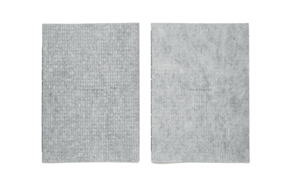


Verónica Fieiras
»The Disappeared (1st and 2nd Edition)«
selected by Josef Chladek
»Paper structures, mosaics, transparencies, enlargement, zooming, deconstructing and overlaying (facial) information – the visual translation of 30,000 people who disappeared in Argentina under the dictatorship during the years 1976–1983 could not be better presented and shown, a book that touches and goes deep under the skin! As the first edition was sold out quickly, the project continues with a second, even more disappearing, edition. It would take another one to two editions, until we ended up with a blank book!«
— Josef Chladek —
Vienna

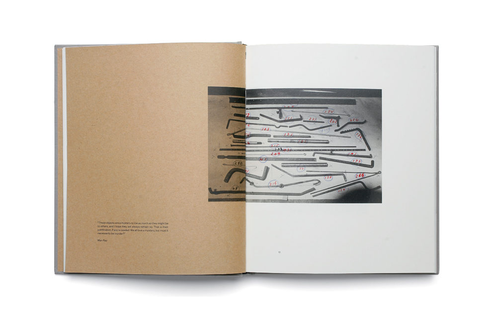


Joan Fontcuberta
»Trepat«
selected by Xavier Barall and Timothy Prus
»I love this book principally because it transcends its historical photobook format by using an enormous dose of irony. Part of its success rests with its nature of stopping just half a millimeter before the irony becomes over-bearing. It is based on the archive of the trepat engineering works that specialized in farm tools and agricultural engineering. The archive actually exists and has been well cared for over many decades. Fontcuberta has woven the images together with a story of how the founder was an aficionado of modernist photography. The founder Josep Trepat Galceran was supposedly a friend and supporter of modernist photographers such as Charles Sheeler, Albert Renger-Patzsch, Laszlo Moholy-Nagy and Alexander Rodchenko. Using an elegant ruse, he never actually states that they were real friends, all is left to our human nature to assemble this message. Many of the illustrations, using photography and illustration, do recall the machine based aesthetics of these acknowledged masters. In many cases they are actually more interesting. The truth is of course that the images accidentally recall the works of modernist photography and bear witness to the inspiration this kind of typological image had on the mainstream modernist movement. Interwoven with the visual essay are images totally constructed by Fontcuberta. The physical make-up of the book and the printing are very standard, but that is exactly what one would expect from such a work. In the end I liked it for becoming part of the history of fake and humorous books. I am sure the attitude to photography encoded in its structure will provide numerous starting points for the work of other artists.«
—Xavier Barall —
London
»I have chosen Joan Fontcuberta’s publication presenting the Trepat family’s photograph collection of agricultural machinery taken by great masters of the time, from Man Ray to Rodtchenko. The contextualisation of these photographs within the book gives an artistic dimension to this industrial imagery. The collection of photographs offers a poetic and surrealist approach to these agricultural machines, inviting us to take a fresh, playful look at common objects. This work concerns all artistic disciplines from photography to sculpture, and questions the medium itself. I am also interested in the fact that Joan Fontcuberta distorts his own book when he t ears some inside pages, thus creating a mise-en-abyme of the book.«
—Timothy Prus —
Paris
Michael Schmidt – Natur
MACK
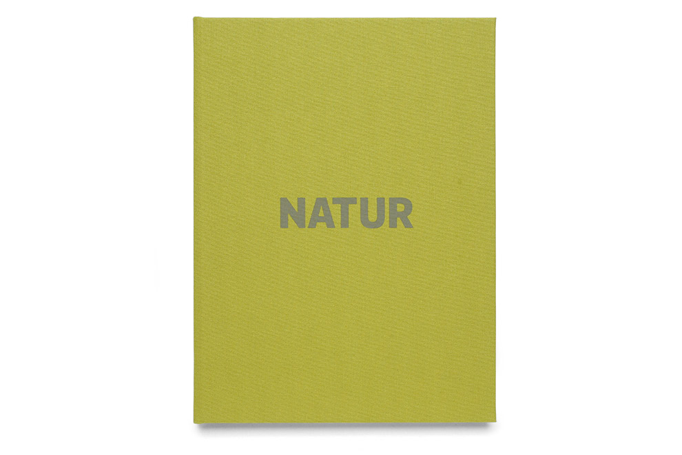

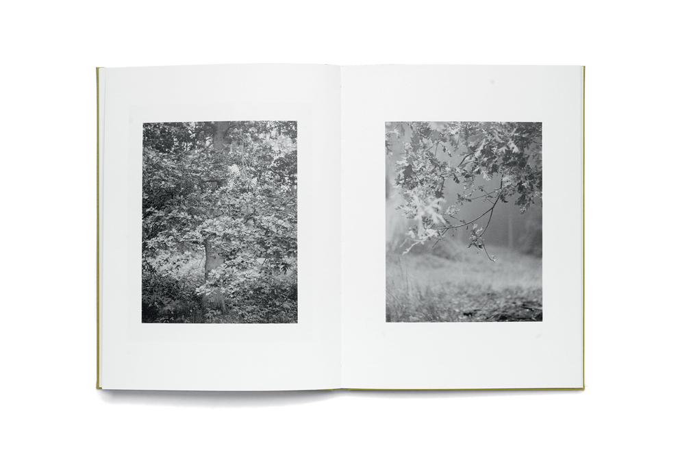
»I would like to nominate Michael Schmidt’s NATUR, which was published recently by Mack. Michael Schmidt died on May 24, 2014, and in this small book of images of nature, which he photographed at the end of the 80s, the artist demonstrates once more, and for the last time, his outstanding skills in sequencing, placing and proportioning his works in the format of an artist’s book. Michael Schmidt, who was already seriously ill at the time of the printing, supervised the production from his bed, but died before being able to look at the final result. NATUR is a typical book of his and an artist’s book par excellence: carefully designed, no text, but full of confidence in the strengths of the pictorial quality of his photographs, creating a narrative by, and also between, the images through the sequence, extending the visual range by some double pages of alternative views of the same subject, creating a kind of telescopic effect by having single images of the same subjects in different sizes on subsequent pages, out of which a wider overall understanding of nature and its importance arises; in short, a demonstration of Michael Schmidt’s photography, his sensitivity and his access to reality, a legacy which we should value and praise.«
– Thomas Weski –
Leipzig